Mabel Profumerie
Mabel Profumerie
Mabel Profumerie


Overview
Mabel Profumerie, a boutique specialized in curated fragrances and cosmetics, approached me to redesign their e-commerce platform.
Their existing website struggled with poor user experience, low conversion rates, and a dated visual identity that didn't reflect their premium brand positioning.
The main goal was to design a refined, intuitive shopping experience that would highlight their carefully selected brand assortment, while significantly improving user engagement and sales performance.
My role
As a UX/UI Designer, I led the entire project independently collaborating directly with the business owner and the development team.
My responsibilities included:
- Competitive analysis and industry benchmarking
- Creation of low-fidelity wireframes
- Design of high-fidelity mockups and interactive prototypes
- Development of a full design system (color palette, typography, UI components)
- Support and supervision during the handoff to developers
Workflow&Process
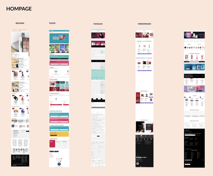
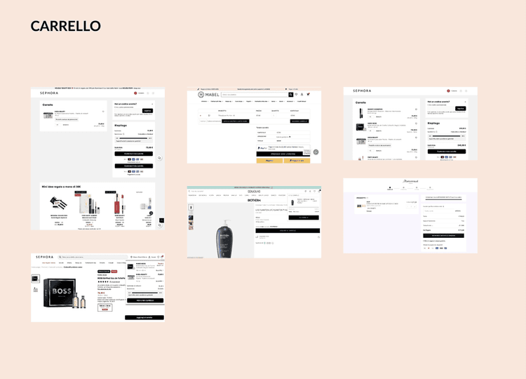
To align with the client's goals—modernizing the site and improving clarity—I started with a detailed analysis of competitors in the beauty e-commerce space.
I focused on several key aspects:
- Visual aesthetics (style, mood, image use)
- Information hierarchy (clarity, spacing, readability)
- Page layout and structure
- User flows (especially for browsing and checkout)
- Individual UI components (such as product cards, filters, and navigation elements)
This research phase allowed me to define clear design principles and identify best practicesthat could be adapted to Mabel Profumerie’s identity and needs.
Workflow&Process
To align with the client's goals—modernizing the site and improving clarity—I started with a detailed analysis of competitors in the beauty e-commerce space.
I focused on several key aspects:
- Visual aesthetics (style, mood, image use)
- Information hierarchy (clarity, spacing, readability)
- Page layout and structure
- User flows (especially for browsing and checkout)
- Individual UI components (such as product cards, filters, and navigation elements)
This research phase allowed me to define clear design principles and identify best practicesthat could be adapted to Mabel Profumerie’s identity and needs.


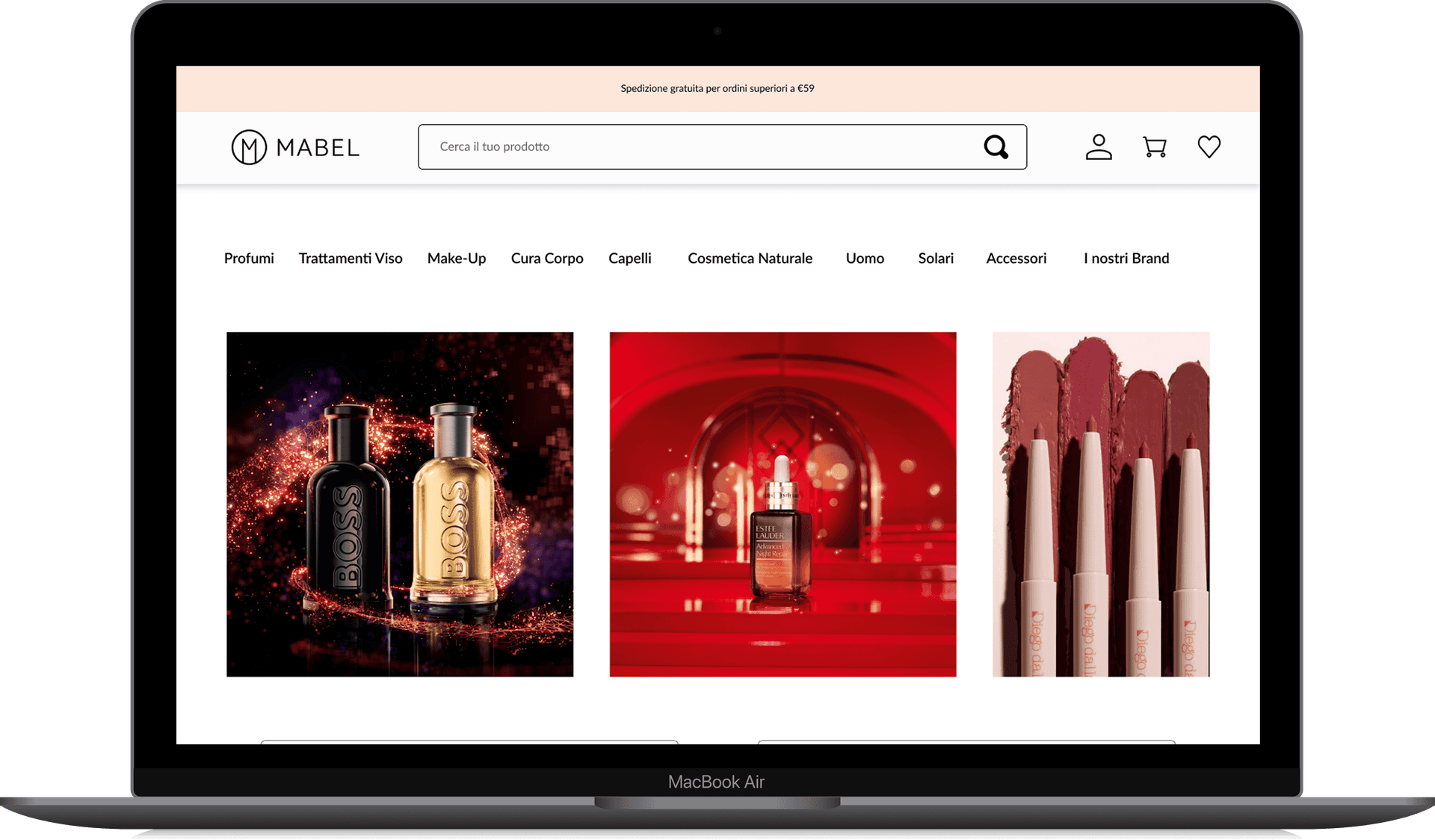
Instead of starting with low-fidelity wireframes, I chose to move directly into high-fidelity wireframes. This was a strategic decision : I needed to better understand the client’s aesthetic preferences and provide visual references early on to facilitate feedback and alignment.
By creating high-fidelity wireframes, I helped the client visually imagine each page, which was crucial for discussing visual direction and defining the mood of the interface.
During this phase, I focused deeply on the structure of individual pages , walking through the user journey step by step—from homepage to product detail, and from cart to checkout My goal was to design a layout that not only looked elegant but also guided the user clearly and intuitively through the shopping process.


I built a cohesive design system tailored to the brand
I focused on several key aspects:
- A soft, elegant color palette
- Clean and legible typography
- Custom reusable UI components (buttons, cards, filters, navigation, footer)
I built a cohesive design system tailored to the brand
I focused on several key aspects:
- A soft, elegant color palette
- Clean and legible typography
- Custom reusable UI components (buttons, cards, filters, navigation, footer)


Using the design system, I created refined mockups and interactive prototypes that simulate the complete user journey —from homepage browsing to checkout.
Using the design system, I created refined mockups and interactive prototypes that simulate the complete user journey —from homepage browsing to checkout.


Development Collaboration
Although I wasn’t involved in the full implementation phase, I supported the developers by reviewing the build process and clarifying design specifications when needed. The new site is not yet online, as the client has not officially launched the redesign.
My Approach & Design Values
This project was particularly exciting because it allowed me to manage every step of the design process —from strategy to delivery. I enjoyed leading client communication, proposing design directions, and translating feedback into practical, user-focused solutions.